The smallest indivisible UI units. No further breakdown possible.
Atoms combined into a discrete, reusable UI unit.

Lorem ipsum dolor sit amet, consectetur adipiscing elit. Suspendisse varius enim in eros elementum tristique.
Lorem ipsum dolor sit amet, consectetur adipiscing elit. Suspendisse varius enim in eros elementum tristique.
Lorem ipsum dolor sit amet, consectetur adipiscing elit. Suspendisse varius enim in eros elementum tristique.
Lorem ipsum dolor sit amet, consectetur adipiscing elit. Suspendisse varius enim in eros elementum tristique.
Lorem ipsum dolor sit amet, consectetur adipiscing elit. Suspendisse varius enim in eros elementum tristique.
Lorem ipsum dolor sit amet, consectetur adipiscing elit. Suspendisse varius enim in eros elementum tristique.
Lorem ipsum dolor sit amet, consectetur adipiscing elit. Suspendisse varius enim in eros elementum tristique.
Lorem ipsum dolor sit amet, consectetur adipiscing elit. Suspendisse varius enim in eros elementum tristique.
Lorem ipsum dolor sit amet, consectetur adipiscing elit. Suspendisse varius enim in eros elementum tristique.
Lorem ipsum dolor sit amet, consectetur adipiscing elit. Suspendisse varius enim in eros elementum tristique.
Lorem ipsum dolor sit amet, consectetur adipiscing elit. Suspendisse varius enim in eros elementum tristique.
Lorem ipsum dolor sit amet, consectetur adipiscing elit. Suspendisse varius enim in eros elementum tristique.

Lorem ipsum dolor sit amet, consectetur adipiscing elit. Suspendisse varius enim in eros elementum tristique. Duis cursus, mi quis viverra ornare, eros dolor interdum nulla, ut commodo diam libero vitae erat. Aenean faucibus nibh et justo cursus id rutrum lorem imperdiet. Nunc ut sem vitae risus tristique posuere.
Lorem ipsum dolor sit amet, consectetur adipiscing elit. Suspendisse varius enim in eros elementum tristique. Duis cursus, mi quis viverra ornare, eros dolor interdum nulla, ut commodo diam libero vitae erat. Aenean faucibus nibh et justo cursus id rutrum lorem imperdiet. Nunc ut sem vitae risus tristique posuere.

Full width page sections build from molecules and atoms

Drag and drop button components into the Button Slot below. Change the hero background image.
Drag and drop button components into the Button Slot below. Change the hero image.
Drag and drop button components into the Button Slot below. Change the hero image.
Drag and drop button components into the Button Slot below. Change the hero image.
Lorem ipsum dolor sit amet, consectetur adipiscing elit, sed do eiusmod tempor incididunt ut labore et dolore magna aliqua. Ut enim ad minim veniam, quis nostrud exercitation ullamco laboris nisi ut aliquip ex ea commodo consequat. Duis aute irure dolor in reprehenderit in voluptate velit esse cillum dolore eu fugiat nulla pariatur.
Block quote
Bold text
Drag and drop cards into the Card Slot element. Select the grid structure needed for the number of cards by changing the variant. By default cards will transform into a slider layout on mobile. To change this, simply type "stack" in the Mobile Layout property field.
Drag and drop cards into the Card Slot element. Select the grid structure needed for the number of cards by changing the variant. By default cards will transform into a slider layout on mobile. To change this, simply type "stack" in the Mobile Layout property field.
Drag and drop cards into the Card Slot element. Select the grid structure needed for the number of cards by changing the variant. By default cards will transform into a slider layout on mobile. To change this, simply type "stack" in the Mobile Layout property field.
Buttons can be added under this paragraph, simply drag and drop a button component into the Button Slot. Cards can be added to the Card Slot element above the image. Change the grid structure and spacing by changing the variant.
Buttons can be added under this paragraph, simply drag and drop a button component into the Button Slot. Cards can be added to the Card Slot element above the image. Change the grid structure and spacing by changing the variant.
Buttons can be added under this paragraph, simply drag and drop a button component into the Button Slot. Cards can be added to the Card Slot element above the image. Change the grid structure and spacing by changing the variant.
Buttons can be added under this paragraph, simply drag and drop a button component into the Button Slot. Cards can be added to the Card Slot element above the image. Change the grid structure and spacing by changing the variant.
Buttons and cards can be added under this paragraph, simply drag and drop components into the Button and Card Slots. Change the grid structure and spacing by changing the variant. A single card can be added on top of the image as a CTA for example.
Buttons and cards can be added under this paragraph, simply drag and drop components into the Button and Card Slots. Change the grid structure and spacing by changing the variant. A single card can be added on top of the image as a CTA for example.
Buttons and cards can be added under this paragraph, simply drag and drop components into the Button and Card Slots. Change the grid structure and spacing by changing the variant. A single card can be added on top of the image as a CTA for example.
Buttons and cards can be added under this paragraph, simply drag and drop components into the Button and Card Slots. Change the grid structure and spacing by changing the variant. A single card can be added on top of the image as a CTA for example.
Lorem ipsum dolor sit amet, consectetur adipiscing elit. Suspendisse varius enim in eros elementum tristique.
Lorem ipsum dolor sit amet, consectetur adipiscing elit.
Lorem ipsum dolor sit amet, consectetur adipiscing elit. Suspendisse varius enim in eros elementum tristique.
Lorem ipsum dolor sit amet, consectetur adipiscing elit.
Lorem ipsum dolor sit amet, consectetur adipiscing elit. Suspendisse varius enim in eros elementum tristique.
Lorem ipsum dolor sit amet, consectetur adipiscing elit. Suspendisse varius enim in eros elementum tristique.
Lorem ipsum dolor sit amet, consectetur adipiscing elit. Suspendisse varius enim in eros elementum tristique.
Lorem ipsum dolor sit amet, consectetur adipiscing elit. Suspendisse varius enim in eros elementum tristique.
Whether you're just starting to explore AI, automation and data solutions or already have initiatives underway, we'd love to talk.
Whether you're just starting to explore AI, automation and data solutions or already have initiatives underway, we'd love to talk.
Whether you're just starting to explore AI, automation and data solutions or already have initiatives underway, we'd love to talk.
Whether you're just starting to explore AI, automation and data solutions or already have initiatives underway, we'd love to talk.
Full width collection lists sections.
Lorem ipsum dolar sit amet, consectetur adipiscing elit. Suspendisse varius enim in eros elementum tristique.
Lorem ipsum dolar sit amet, consectetur adipiscing elit. Suspendisse varius enim in eros elementum tristique.


Blackbook AI implemented a machine learning–driven forecasting and scheduling solution that transformed manual call centre planning into a data-driven, scalable workforce optimisation framework.

Blackbook AI developed a constraint-based scheduling engine that optimises complex rail yard operations in real time, improving on-time performance, throughput, and operational consistency.

Blackbook AI implemented a Document Understanding solution that automated remittance advice processing, improving reconciliation accuracy and freeing accounts receivable capacity.

Blackbook AI implemented an automated document processing solution that streamlined new employee onboarding, reduced manual effort, and improved data accuracy.

Blackbook AI implemented an RPA solution that automated room rate verification, improved pricing accuracy, and enhanced guest experience.

Blackbook AI implemented an RPA solution that automated employee offboarding documentation, reduced administrative burden, and ensured timely compliance.

Blackbook AI implemented an automated CRN update solution that reduced backlog, improved data integrity, and accelerated customer record processing following a large-scale data breach response.

Blackbook AI implemented a Power Platform solution that automated international student application assessments, improved compliance, and significantly reduced processing time.

Blackbook AI implemented a Power Platform solution that automated incident report reviews, reduced manual workload, and improved processing accuracy and timeliness.

Blackbook AI implemented an end-to-end automation solution that streamlined customer onboarding, improved data accuracy, and accelerated billing system integration.

Blackbook AI implemented an RPA solution that automated fixed-term contract renewals, improving processing speed and freeing HR teams for strategic work.

Blackbook AI implemented an AI-powered automation solution that accelerated candidate vetting, improved placement accuracy, and reduced recruitment costs.

Blackbook AI implemented an RPA solution that automated processing of invoices without purchase orders, improving efficiency and accuracy while reducing manual effort.

Blackbook AI implemented an automated invoice processing solution that accelerated workflow, reduced errors, and improved operational efficiency.

Blackbook AI implemented an automation and analytics solution that streamlined invoice processing, improved accuracy, and provided real-time financial visibility.

Blackbook AI implemented an automated invoice processing solution that increased efficiency, reduced errors, and enabled scalable accounts payable operations.

Blackbook AI implemented an automated claims processing solution that accelerated claim resolution, reduced errors, and improved customer experience.

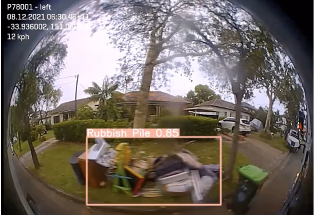
A local council engaged Blackbook AI to develop a solution that would harness the council's garbage truck cameras as a reliable and consistent source of data for detecting rubbish piles and mattresses left on the kerbside.
A city council engaged Blackbook AI to build a solution that could provide complaint sentiment analysis to deliver insights and identify trends.

A public transport company engaged Blackbook AI to investigate technical solutions to understand people's movements at stations in order to improve safety and incident response.

A leading Australian beef supplier struggled with traceability and quality control in their meat processing line, risking waste and inefficiency that affected their bottom line and the premium quality expected by customers.

A leading food production company aimed to improve food safety and product integrity by implementing an advanced defect detection solution to prevent contaminants from reaching consumers.

Blackbook AI implemented an NLP-powered Insurance Claims Agent to automate communication, streamline workflows, and proactively monitor delays.
Lorem ipsum dolar sit amet, consectetur adipiscing elit. Suspendisse varius enim in eros elementum tristique.
Record of all other cards found across the site that are not part of the component library due to their specific structures.
Located on Home Page
Located on Home Page
Lorem ipsum dolor sit amet, consectetur adipiscing elit.
Do not remove. The classes below set the different states of the filter checkboxes